
link:
https://images.search.yahoo.com/search/images;_ylt=Awr9DJYPhZZccGsAc6hXNyoA;_ylu=X3oDMTE0Nmg1bnE3BGNvbG8DZ3ExBHBvcwMxBHZ0aWQDQjY4MzNfMQRzZWMDcGl2cw–?p=north+face+ad&fr2=piv-web&fr=mcafee#id=1&iurl=https%3A%2F%2Fwhatthehill.org%2Fwp-content%2Fuploads%2F2017%2F07%2FThe-North-Face-Ad-300×218.jpg&action=click
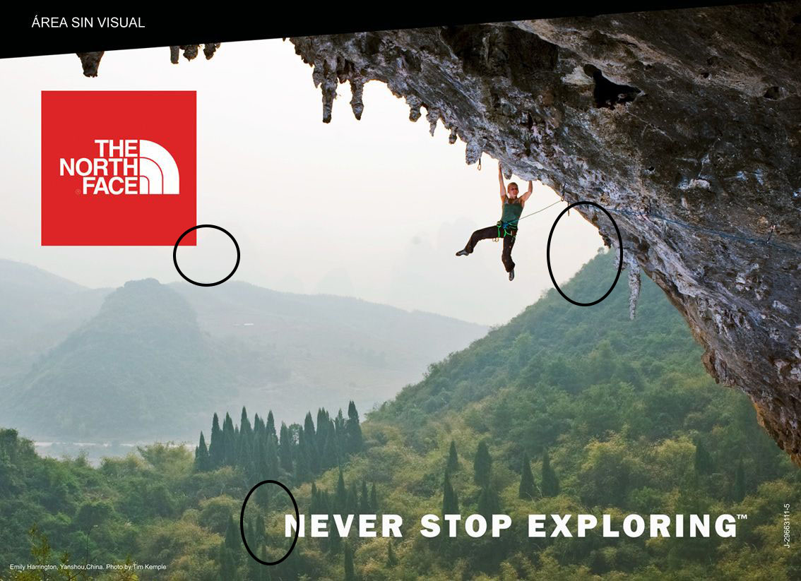
This ad uses several contrasting colors that add to and make the ad that much better. First the red against white with the logo and the sky behind it, which helps make the logo stand out. Then there is the white against green, the phrase against the green mountain, in choosing those colors the words stand out which make them readable. Finally, the green mountain, brown cliff and grey sky ad a picturesque feel to the overall ad layout and color scheme.
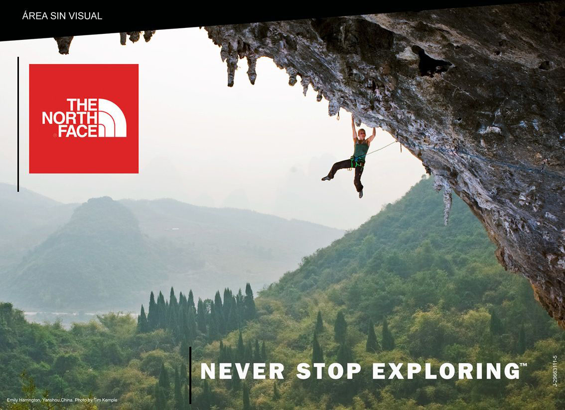
For this ad, what I noticed in terms of alignment was that while the wording and the logo both seem to be going in the same direction. Although aligned differently, differently in a sense they both look as though they are aligned right. This works because both the logo and the writing stand out and are seen.

The typography in this ad really fit well with not only the overall style of the ad but didn’t look out of place against the outdoor background. I am guessing they used some kind of Sans font with the “Never stop exploring” writing. The North face logo is always a classic, I research what kind of fonts they might use, and they use their own special fonts which is most likely why it is so recognizable to everyone who sees it.
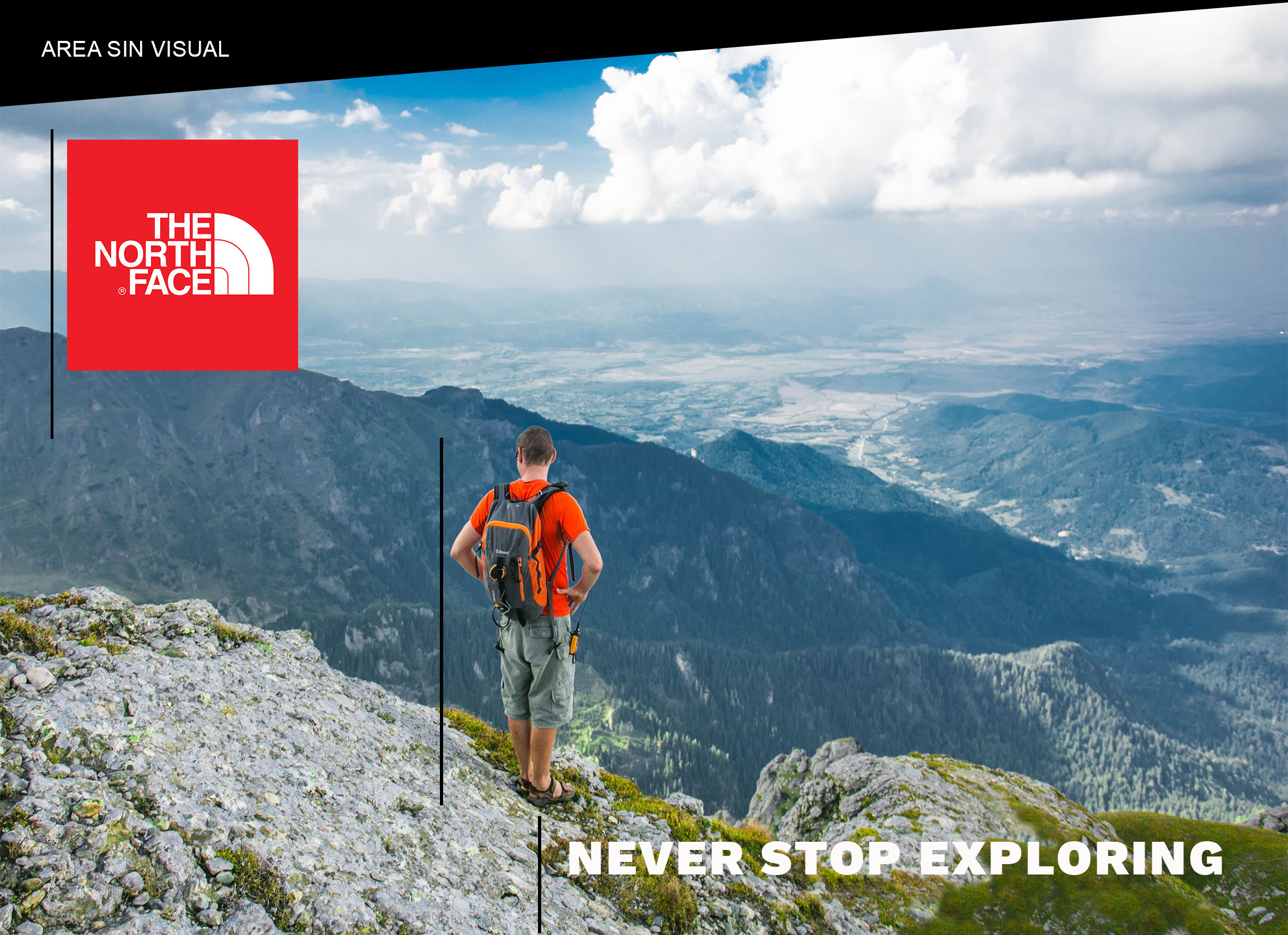
On the ad I created, somewhat uses the same alignment as the original. However mine has a bit more organized alignment that goes from left to right as you can see indicated by the black lines. It starts with the logo then the man, then the writing. This alignment, I believe helps to lead the eyes to the next part of the ad while someone is looking at it. It helps emphasize the most important parts.

The color scheme in this recreation of the original ad, helps to voice the overall message. Again, the logo, against the dark grey mountain and light grey sky make the logo pop, so you know exactly what brand is being advertised. The color of the hikers shirt and how the mountain behind him is a bit blurry make it so he is the part that stands out. By doing that, someone looking at the ad will see that he is very clearly a hiker. Then the contrasting colors of the wording and the cliff. Those three colors, white, grey and green, compliment each other nicely while neither is more important than the other.

With the new ad, the only difference in typography with my new ad is the font I used. For this, I used a work sans. This typography was almost exactly like the original however the letters aren’t as thick. It still keeps the integrity of the ad.
Conclusion
Recreating the original ad was not that easy. Finding the right fonts, finding a picture that kept the feel of the original, and putting it together were all difficult tasks. However The new ad that I created has the same message as the original because it has the same color schemes, similar typography and alignment. The new ad works the same way as the original and the message is exactly the same. I am very proud of my work.
